At A Glance...
1
Art Direction
From overseeing production timelines and ensuring deadlines are met,
to giving direction to photos studios
and adhering to brand quidelines;
I've got 7 years of experience in the creative process from ideation
to execution of customer facing media.
2
Graphic Design
Proficiency in Adobe Creative Suite allows me to create creative assets of all kinds. From GIFs to brochures to websites/apps, oh my!
3
Team Work
I love operating as part of a team, and I'm a self-starter at heart. When we all work at our best, we create the best! It's all about communication, developing those professional relationships, and an openness to/pursuit of honest feedback.
What have I
been up to?
peruse some of the design work I've done so far
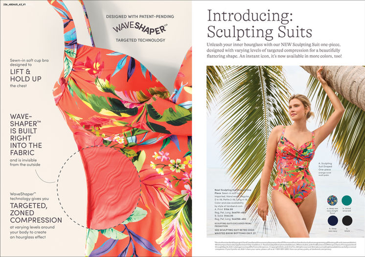
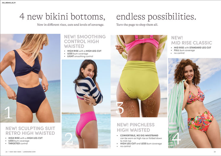
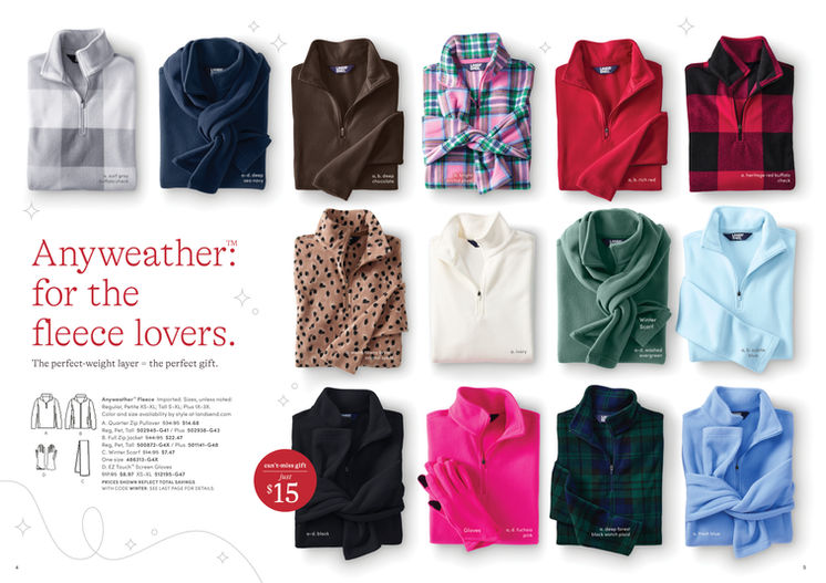
Lands' End
Lighthouses, catalogs and growth, oh my!
For the past 7 years I have had the pleasure to work on the internal creative team at Lands' End.
A great crew, some incredible cross-functional collaboration and so much learning.
Starting out in Mens' and Home in 2018, fresh out of college, I have stretched my arms
in the creative print world and worked in almost every division. For the past few years
I have worked within their core business, delivering creative and translating concepts into reality.
Working on celebrity collaborations like Lands' End x Blake Shelton and Lands' End x Draper James, among others, and dipping my toes into to seasonal concepting and ideation..
I have formed an overarching perspective and appreciation for handling multiple ever-changing timelines and cross-functional collaboration with our merchants, photography studios and designers.
Student Work
Ah, yes... where it all began.
During my education at Savannah College of Art and Design, I was immersed into the history, practice and many formats of design and the creative process. From target audience research on a giant, hand-written paper roll each package design class (plenty of glue sticks saw some serious mileage), to learning html, css, and building a website from the ground up
in my web design courses, I gained an expansive knowledge into creating full design systems
inclusive of print and digital deliverables.
Scroll below to peak at some of the student work I completed during my education at SCAD!
Phillipe Starck
Some of the most rewarding classes during school,
for me, were my typography courses.
I learned about everything from the origins
of phonetic and pictographic languages
to gridding practices and printing history.
It gave me such an appreciation for print media
and the creative process. Everything from cave paintings, to how we experience phonetic language, to the implications of certain type families
and formats based on their historical context...
what a ride!


Negative
This project was a personal. Rh Negativity in women
is a generally benign thing. Both men and women can have
an Rh negative blood type. However, the affects are mainly seen in women during pregnancy. The Rhesus protein is found on the surface of the red blood cells and in those who lack it,
is responsible for the production of anti-bodies to fight viruses and other intrusive threats to the human body caused by
an immune response to Rh positive blood. This project aimed
to educate and inform an audience about the ins and outs
of Rh negativity through large eye-catching visuals
and a walkable exhibition. The artwork used throughout
this project was created by the very talented Hugette Despault May, who has given explicit permission for the use
of her artwork. All credit for her beautiful rope artwork
goes to her alone.


Square One
Square One was a hypothetical condominiums company that aimed to create housing for millenials in towns which weren't what they once were.
Plenty of cities are essentially paying millenials
to come live, lay down roots and revitalize communities. In order to create more incentive
to settle into these spaces, Square One offered appealing and affordable apartment-style housing while encouraging residents to immerse themselves
in the culture to build and grow. Visuals centered around the "busy bee" trope and took a fun,
light-hearted voice to this design system.
Along with a functional website (smartphone compatible) and print items, the pamphlet included
a jar of honey as a take-away.


Louisiana Sweetie
Louisiana Sweetie is a package design project centered around the flavors and historic feel of New Orleans, Louisiana. Visuals were inspired by greco-roman architecture throughout the historic garden district and the jasmine vines growing all around uptown.With chocolate bar flavors like Cayenne Pepper,
Magnolia Honey and Bourbon Whiskey.
This was my introduction to package design,
and while it was my most challenging area of design,
it was one of the most rewarding
and perspective-forming design courses I took.
Movie Quotes
This was such a fun project to work on!
The aim of this was a series of posters to spark excitement and love around classic films.
Just some good ole fun with type and visuals!


